
Case Study
Americans are increasingly comfortable going online to research medical care options. The rise of mobile and virtual medical consultations drives a desire to have an assistant in your pocket for most major decisions.
Existing eldercare service offerings like A Place For Mom and Care.com refer their users to their network member partners who pay referral fees for every new nursing home resident they sign up. These referrals are really just marketing for senior living communities and nursing homes.
In contrast, Inovalon, a leading provider of cloud-based SaaS solutions empowering data-driven healthcare, has actual data on which facilities have the best outcomes for older adults with specific conditions and has an opportunity to become the 'Consumer Reports' of eldercare facilities in the US.
Inovalon asked us to help them utilize their data on independent/assisted living and skilled nursing facilities across the country to research the market feasibility of, and create a Zero to One, direct-to-consumer product (CareAdviser) that assists consumers that are facing a difficult decision regarding eldercare of a loved one to make informed choices using unbiased data and personalized recommendations.
Inovalon * Bowie, MD
Zero to One Strategy * UX Lead * Stakeholder Workshops * Consumer Research & Analysis * Competitive & Pricing Research * Information Architecture * Onboarding Process Visualization * Concept Ideation * Wireframing * Creative Direction * Visual & Interaction Design
Microsoft Teams * Microsoft Powerpoint * Adobe InDesign * Adobe Photoshop * Sketch * Trello * Popetech

We conducted qualitative research in the form of focus groups with 5 small groups of people who were all either currently making an eldercare decision or would need to make an eldercare decision within the next 6 months.
We asked them questions about who they were helping in the care decision making process, what health conditions their loved one was experiencing, which facility amenities and features were important to them, and if they had used any existing products or services currently in the market like A Place For Mom or Care.com and what their thoughts on them were. We also asked if it mattered to them whether the facilities recommended paid a referral fee to the referring site for signing up new residents.
We also created a simple MVP prototype that captured our initial thinking on some key site pages & processes (shown below). We walked through that prototype with our focus groups and captured their reactions, interest level and thoughts on content and features they would want to see to help them make their decisions.
Is there a need?
In short, yes. There is a clear and immediate need for an eldercare decision tool. Three factors define the need:
Nearly all the people making an eldercare decision would use a tool to help them make better decisions. The benefits they’d expect:
Our research revealed that the core needs of the product are relatively simple:
After analyzing our research and socializing our takeaways with our project stakeholders, we worked together to create the structure of our site, including a Resources section that would house search engine optimized content to drive those looking for help to our platform and provide value in their search.
We knew there would be a need for an onboarding process to ask relevant questions in order to provide personalized recommendations so we started thinking through the potential steps of that "Get Started" workflow.

We then began iterating with our stakeholders to define what steps would be required and what questions were necessary to ask our users in order to make the best care recommendations. We worked with our client to keep the process to as few steps and questions as possible, knowing this would help to increase conversions. The wireframes and notes shown here are one set of many iterations we went through, refining the process with our project stakeholders.

Wireframes for the rest of the website outside of the Get Started process also required several rounds of iteration as we worked through home page content, membership and pricing possibilities, how to present and rank search results and what value-added services to offer.


The finished visual design of the website conveys a friendly and helpful tone. Membership pricing and options are clearly communicated at multiple points in the funnel and users are kept informed of the information needed to make recommendations, the reasons why, and that their information is safe and secure.
Search engine optimized Resource topics, articles and FAQs help to bring in organic traffic and educate users about long-term care options and all the factors that are a part of the decision-making process.


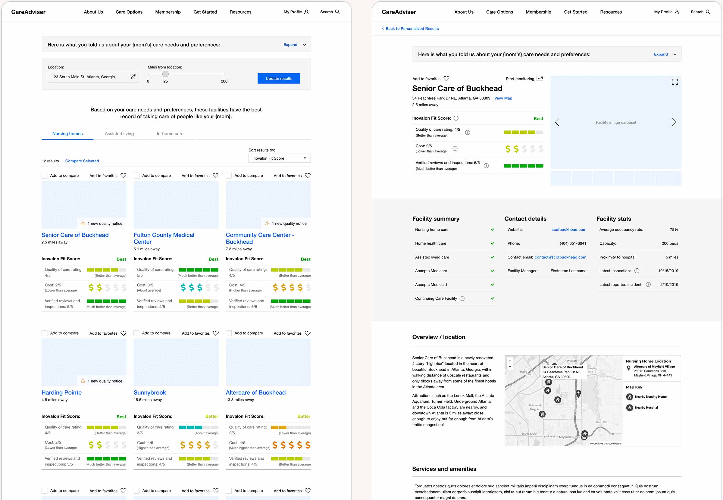
Personalized, data-backed recommendations for the best care are presented to the user after completing the Get Started onboarding process. We created a visual ranking system that displays three primary care quality metrics: overall quality of care (as compared to other facilities), cost, and verified reviews and inspections. These data points were placed on a scale from 1 to 5 to make comparing facilities simple and visual. A "Fit Score" of Good, Better and Best provides an at-a-glance recommendation based on all the available data. More details for each facility, including a photo gallery and contact info, are presented on the facility details page.
A comparison tool allows users to compare facilities side-by-side while premium users can access monthly quality monitoring reports and receive alerts if anything changes about the quality of care for their loved one.
As their loved one's medical needs change over time, the user's care preferences profile can be updated, which refines the facility recommendations they are presented with, ensuring the best fit and highest quality care for their loved one.


