Case Study
The Menopause Society (formerly The North American Menopause Society or NAMS) empowers healthcare professionals working across the menopause journey with certification, tools, patient-facing resources, and professional development opportunities to improve women’s health and healthcare experiences — a commitment backed by evidence-based medicine, decades of industry leadership, and a passion to improve women’s lives.
We were asked to create a compelling new brand to better represent the mission and vision of the organization while modernizing an out of date website to better serve two key audience groups: health care professionals and patients.
The Menopause Society * Distributed 501(c)(3) nonprofit
Design Strategy & UX Lead * Stakeholder Workshops * Information Architecture * Concept Ideation * Wireframing * Creative Direction * Visual & Interaction Design
Microsoft Teams * Microsoft Powerpoint * Octopus.do * Adobe InDesign * Adobe Illustrator * Adobe Photoshop * Sketch

We created a survey asking for feedback from Society members about their membership experience to inform and guide the strategies we pursued, ensuring member needs were being met and giving us valuable information on members thoughts, feelings and impressions of The Society, as well as it's future brand and website.
We also conducted several focus groups with professional members and patients to better understand the needs of our 2 distinct audience groups. The insights from this research were all then provided to our content team as they started to work with the client on a content strategy to meet the audience needs.


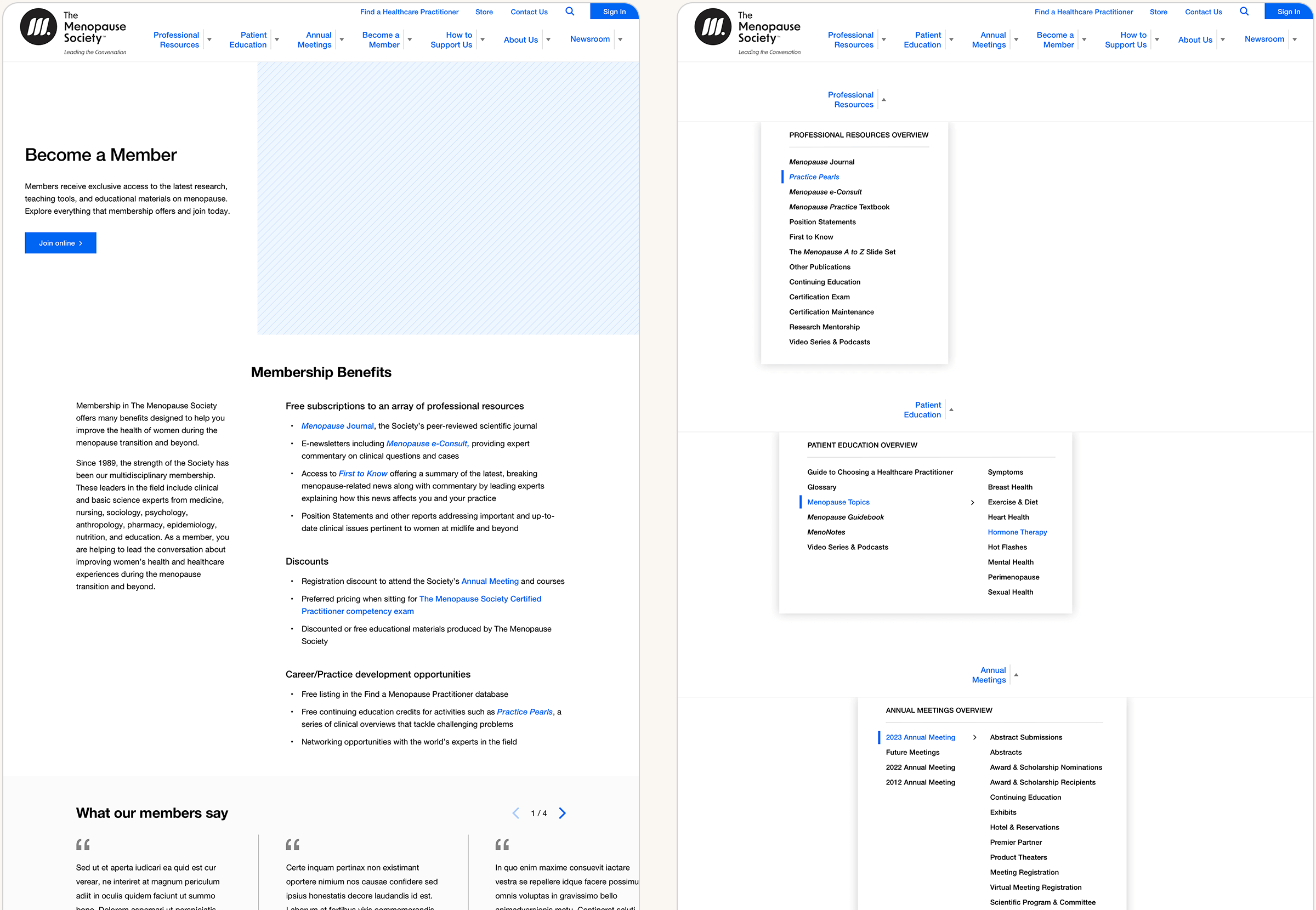
In a series of project stakeholder working sessions, I facilitated discussions around what content was important, how to organize it and how we would gate content intended for Society Members. I used Octopus.do to create a sitemap that not only visually depicts the structure of the future site, but also serves as a content outline of each page within the site, capturing everything our content team would need to write for each page. Note: Below is a simplified view.

Our team helped The Menopause Society (formerly The North American Menopause Society) to reposition the organization to better represent the Society for growth and relevancy in the future.
The new name (The Menopause Society) more accurately reflects and highlights the inclusivity of the organization and the fact that membership has never been limited only to those from North America.
The new tagline (Leading the Conversation) positions the Society as the definitive resource for healthcare professionals and the public for accurate, unbiased information about menopause and healthy aging.
The shapes, colors and typefaces chosen for the new logo combination are minimal and modern. The three segments of the symbol create an abstract “M” followed by a period, which signifies the organization’s position as the leading authority on menopause and menopause care. The symbol's three segments also represent the three stages of menopause (premenopause, perimenopause, and postmenopause), while the forward lean conveys optimism, and the deep blue and violet colors denote wisdom and trustworthiness.


As part of the rebranding effort, we created a style guide based on concepts we had identified to establish a well-defined visual identity for The Society going forward.
The style guide served both to inform and give direction to the design phase for the new website and to provide the client with direction on how to apply the new brand to marketing materials in the future.
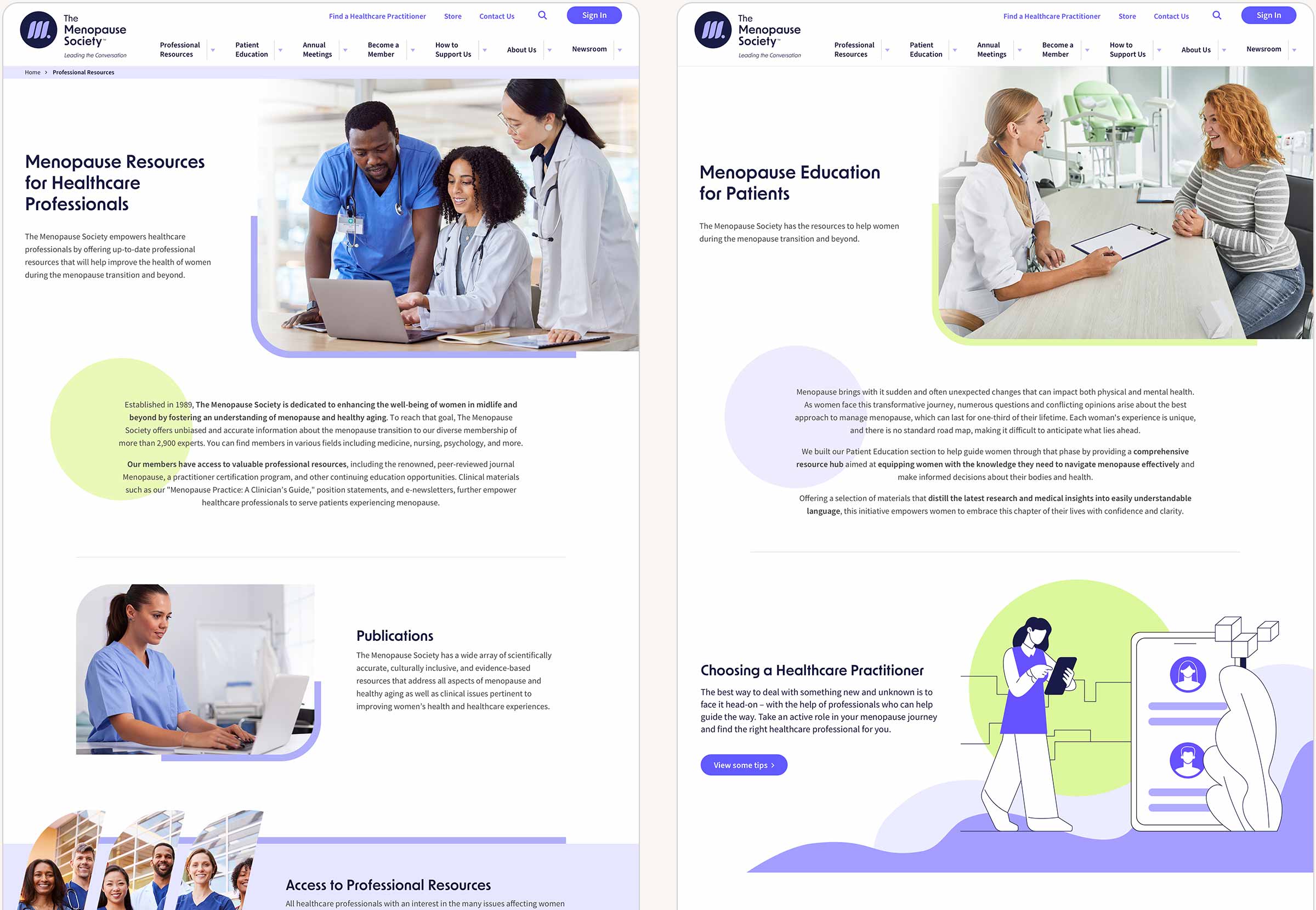
Custom illustrations and icons are used in combination with photography capturing real people interacting with health care providers to create a uniquely identifiable quality to all branded materials, establishing The Society as the definitive resource for healthcare professionals and the public for accurate, unbiased information about menopause and healthy aging.


The final wireframes served as our blueprint for designing and building the new site. Several rounds of revisions ensured we accounted for all content and component types and aligned everyone's expectations of how the new site would be structured. I also facilitated technical workshops with our development team to ensure that they understood the intent and we could discuss any gray areas so that they could begin building the base framework of the site while the design was being iterated on.


The website design solution brings together all of the new brand elements and creates a clean and modern feel while using a voice that is passionate, smart, approachable, confident and inclusive. After going live in September 2024, the initial feedback has been overwhelmingly positive from both professional members and patients in need of help.
The before and after home pages shown below showcase the transformation of both the brand and the website, creating a web presence that is much more professional and trustworthy and prioritizes ease of access to information.